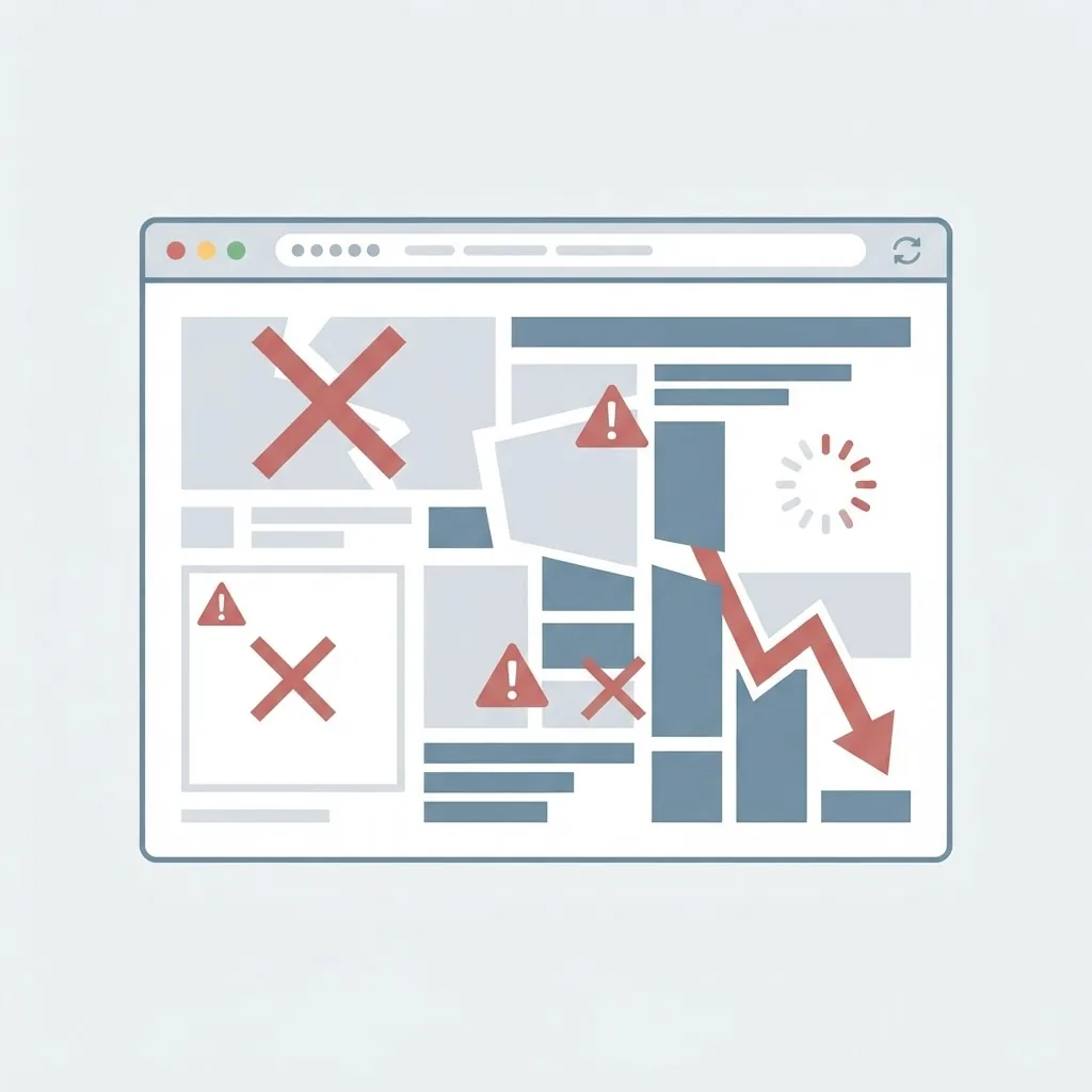
Discover the most common web design mistakes that quietly cost you traffic, trust, and conversions, and learn practical ways to fix each one.
Last updated: July 20, 2026
Introduction
Most websites do not fail because of one dramatic error. They underperform because of a collection of small, avoidable common web design mistakes that quietly erode trust, slow down pages, and confuse visitors. Individually each issue seems minor. Together they push people to hit the back button and hand your traffic to a competitor.
The good news is that nearly every common mistake is fixable once you can recognize it. This guide walks through the design errors that do the most damage in 2026, explains why each one hurts users and search rankings, and gives you practical, plain-language fixes you can apply right away. Whether you built your site yourself or inherited it, these principles will help you spot problems before they cost you customers.
Table of Contents
- Why small design mistakes cause big losses
- Mistake 1: Slow-loading pages
- Mistake 2: Poor mobile experience
- Mistake 3: Confusing navigation
- Mistake 4: Weak visual hierarchy
- Mistake 5: Ignoring accessibility
- Mistake 6: Unclear calls to action
- Mistake 7: Cluttered, text-heavy layouts
- Mistake 8: Neglecting SEO fundamentals
- Frequently asked questions
- Conclusion
Why Small Design Mistakes Cause Big Losses
Users judge a website in a fraction of a second. If the first impression is slow, cluttered, or confusing, they rarely give it a second chance. Search engines notice too: high bounce rates, low engagement, and poor Core Web Vitals all signal that a page may not be serving visitors well.
That is why design mistakes are rarely "just cosmetic." A cramped layout or a buried button changes real behavior, which changes real revenue. Treating design as a business function rather than decoration is the first step to avoiding costly errors.
Mistake 1: Slow-Loading Pages
Speed is the single most common and most damaging design mistake. Oversized images, bloated scripts, and unoptimized code make visitors wait, and many will not.
How to fix it: Compress and correctly size images, serve modern formats like WebP, lazy-load below-the-fold media, and remove scripts you do not need. Aim to meet Google's Core Web Vitals thresholds. If performance problems run deeper than images, professional front-end web development can restructure how assets load so pages feel instant.
Mistake 2: Poor Mobile Experience
Most traffic is mobile, yet many sites are still designed on large monitors and only checked on phones as an afterthought. The result is tiny tap targets, text that requires zooming, and layouts that break.
How to fix it: Design mobile-first. Start with the smallest screen, ensure buttons are large enough to tap comfortably, keep font sizes readable, and test on real devices. A responsive, mobile-first build is now the baseline expectation for any professional website design project.
Mistake 3: Confusing Navigation
If visitors cannot find what they need within a few seconds, they leave. Overloaded menus, vague labels, and inconsistent navigation between pages all create friction.
How to fix it: Keep primary navigation short and label items with words your audience actually uses. Group related pages logically, keep navigation consistent site-wide, and include a clear path back to the homepage. A simple rule: any important page should be reachable in three clicks or fewer.
Mistake 4: Weak Visual Hierarchy
Visual hierarchy is how design guides the eye toward what matters most. When everything shouts for attention with equal size, weight, and color, nothing stands out, and users feel overwhelmed.
How to fix it: Establish a clear order of importance. Use larger, bolder headings for key messages, generous spacing to separate sections, and a restrained color palette that reserves your accent color for actions. Whitespace is not wasted space; it is a tool that makes content easier to absorb.
Mistake 5: Ignoring Accessibility
Designing only for sighted, mouse-using visitors excludes millions of people and creates legal and reputational risk. Low-contrast text, missing alt text, and keyboard traps are all common accessibility failures.
How to fix it: Follow WCAG guidance. Ensure sufficient color contrast, add descriptive alt text to meaningful images, make sure the site works with a keyboard, and use proper semantic HTML. Accessible design also tends to be cleaner and more usable for everyone, which improves overall quality signals.
Mistake 6: Unclear Calls to Action
A beautiful page that does not tell visitors what to do next wastes its potential. Buttons labeled "Submit" or links that blend into the text leave users guessing.
How to fix it: Make each key page have one obvious primary action. Use descriptive, benefit-driven labels such as "Start your free trial" instead of "Click here." Give buttons enough contrast and space to stand out, and avoid competing calls to action that split attention.
Mistake 7: Cluttered, Text-Heavy Layouts
Trying to say everything at once buries your most important message. Dense walls of text, too many competing elements, and cramped spacing make pages exhausting to read.
How to fix it: Break content into short paragraphs, use descriptive subheadings, and support key points with visuals. Well-designed graphics, including clear infographic design, can communicate complex ideas faster than paragraphs and keep visitors engaged. Prioritize ruthlessly: decide what one thing each page must accomplish.
Mistake 8: Neglecting SEO Fundamentals
Design and SEO are deeply connected, yet many sites ship with missing title tags, skipped heading levels, non-descriptive links, and images with no alt attributes. These oversights make it harder for search engines to understand and rank your pages.
How to fix it: Use a single, descriptive H1 per page, follow a logical heading order, write meaningful link text, and keep URLs clean. Pair solid technical structure with genuinely helpful content. If search visibility is a priority, combining design with dedicated digital marketing and quality content writing turns a good-looking site into one that actually gets found.
A Quick Pre-Launch Checklist to Catch Mistakes Early
Most of the errors above are far cheaper to fix before launch than after. Building a short review ritual into your workflow catches the majority of them while there is still time to act.
Before any site goes live, walk through a simple checklist. Confirm every page loads quickly on a mid-range phone over a normal mobile connection, not just on your fast office Wi-Fi. Tap through the primary navigation on a real device to make sure menus, buttons, and forms are usable with a thumb. Check color contrast on text and buttons, and try navigating the whole page with only a keyboard. Validate that each page has one clear H1, a logical heading order, and descriptive link text. Test every form, including error states and the confirmation message people see after submitting.
It also helps to review the site with fresh eyes. Ask someone who has never seen it to complete a common task, such as finding your pricing or contacting you, and watch where they hesitate. Those hesitation points reveal design mistakes that internal teams stop noticing because they already know where everything is.
Finally, treat launch as a checkpoint rather than a finish line. Set a reminder to review analytics, Core Web Vitals, and search performance a few weeks after going live. Small, data-informed adjustments over time prevent the slow accumulation of the very mistakes that hurt rankings and conversions in the first place.
Frequently Asked Questions
What is the most common web design mistake?
Slow page speed is the most common and damaging mistake. Oversized images and heavy scripts make visitors wait, increasing bounce rates and hurting both conversions and search rankings.
How do design mistakes affect SEO?
Poor design increases bounce rates, lowers engagement, and worsens Core Web Vitals, all of which can reduce rankings. Missing headings, alt text, and descriptive links also make pages harder for search engines to understand.
Is too much whitespace a design mistake?
No. Whitespace, used intentionally, improves readability and focus. The real mistake is clutter, not empty space. Generous spacing helps users process content more easily.
How often should I review my website for design mistakes?
Review key pages at least a few times a year, and after any major content or platform change. Regular checks of speed, mobile experience, and broken links prevent small issues from compounding.
Can I fix these mistakes myself?
Many fixes, like clearer navigation labels, better calls to action, and compressed images, are approachable. Deeper performance or accessibility work often benefits from professional development support.
Do these mistakes really affect conversions?
Absolutely. Friction from slow speed, confusing navigation, or weak calls to action directly reduces the number of visitors who take action, which lowers revenue even when traffic stays the same.
Conclusion
Great web design is often about removing friction rather than adding flourishes. When you eliminate the common mistakes, slow pages, poor mobile experiences, confusing navigation, weak hierarchy, inaccessible elements, unclear actions, clutter, and neglected SEO, you create a site that feels effortless to use and easy for search engines to reward.
Audit your site against this list, fix the biggest offenders first, and watch trust and conversions climb. If you would rather have experts diagnose and resolve these issues for you, take a look at our website design services and let's build a site that avoids every one of these pitfalls.